I was on a site called Design Milk this morning reading about the Visa Project, which according to Design Milk “is a lifestyle collective started by David Vivirido and Francesco Sourigues in 2018, will present their second pop-up exhibition in New York during NYCxDESIGN and ICFF.”
Their article is about furniture designs with a large collection of photos showcasing the work. I am the first to say that I am a complete beginner when it comes to discussing furniture designs. I do know what I like, and my tastes tend to be more minimalist or maybe even industrial. This furniture falls into that area, but the article I’m writing today isn’t about furniture, it’s about the space the work is in more than anything.
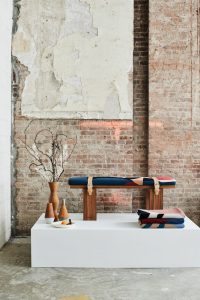
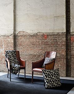
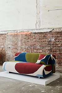
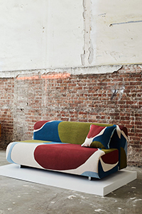
So as I mentioned I was scanning the page admiring the work when I realized that it wasn’t really the furniture that I was admiring, but it was the space the pieces were displayed in. Don’t get me wrong, the furniture is outstanding, but what really caught my eye was that nearly all the photos looked as if they were taken in an abandoned building. The building, possibly and old warehouse, was complete with exposed cement floors and bare electrical boxes. All the peeling paint and exposed bricks seemed to enhance the pieces exponentially. I think it’s the juxtaposition of refined with rough that makes it seem so cool to me. I’ve never understood why I am drawn more to locations like this than I am to modern, sophisticated locations, but I am. A rough, rock wall will draw me in faster than a modern glass wall, and I could say the same for architecture. Take the Guggenheim Museum in Bilbao for instance. I respect and in some ways admire the design of the building, but when pressed I don’t actually think I ‘like’ it. It doesn’t ‘call to me’ like other buildings.
Maybe it’s the idea that I had starting out that I wanted to be that “hipster artist” in NYC creating great artistic works. You may know the stereotype, they have one section of their loft as a workspace and the remaining is living area. I guess it was just a dream I had, though until I wrote the word “dream” I don’t think I ever considered that it was in fact a dream. Nevertheless, I love the images in the article mainly because of the location.


I’m going to post some of the images from the article here to give you an idea of what I’m writing about, but in all honesty I don’t know if I’m infringing on copyrights.
Let me know how you feel about it. Are you the same as me, doesn’t the ‘rough’ nature of the space draw you in? Maybe I’m crazy or possibly just confused.

