Domain Name 101

So you’ve got a great idea for a site and you’re thinking about doing it yourself. Good choice! When I first started back in the late nineties I tried out a lot of different ways to get my site online. If you’re old enough to remember, the biggest thing going was the free hosting from many providers. You only had to have their banner stuck to your page somewhere. If I were to sum up the service back then it would be ‘terrible.’ They rarely gave you the ability to control your site the way you wanted. You were limited by their control panels and what kind of languages you could have in your code. It was the wild west back then and I have to admit looking back it was kind of fun.

So how do you get started?

The first thing you’re going to need once you have an idea for a site, is a domain name.
A domain name is registered with an organization like ICANN though registrars like godaddy.com and namecheap.com. What you need to know when registering a domain name is that it’s really not like it used to be. Ten years ago it was important to register a top level domain(tld) otherwise your site wasn’t considered real and people would be confused by something other than, .com, .org, or .net. I don’t think it’s that way anymore. Over the past few years the flood of different domain extensions have increased to the point where it doesn’t really matter anymore. What’s important is that the name is memorable. If I registered a .design domain name as kens.design, it would be easy to remember, and that is the key. If your domain name is memorable, you can’t lose.

My personal choice for purchasing domain names is Namecheap.com. I don’t have any affiliation with them except that they have been good to me. There are a lot of good ones, and some hosting companies will include a domain name in their hosting offer. I wouldn’t do that, it’s better to keep it separate. You register the domain name, then search for a good host. When I was first starting out, I went for the deal on hosting that included a free domain name. All good, right? Well, after a few days I couldn’t upload anything to the server and out of frustration I canceled the hosting. Not a big deal except they kept the domain name and I didn’t blame them for it. But on my side, the name that I had chosen, the name that I spent hours researching and second guessing until I was positive it would work for my new business, was now gone. I considered it a lesson learned.

Beware, many registrars just want to get your money.

When you’re shopping for a domain name remember to ignore the first price. For example there are many domain registrars that will give you a discount for the first year or two, but then charge full price from then on. Don’t be fooled, some domain extensions can be upwards of $100 per year and you may feel obligated to stay with them because you don’t want to change names.

Okay, I decided for this lesson that I’d research what the going rate for the tlds are. I went to the sites below and searched for “thisisapricecheck” and the results are listed. I have to say that I was disgusted with networksolutions.com. They automatically added my search into the checkout, they didn’t list the prices until I clicked the checkout button, and then they added services that are simply not needed. I would avoid them at all cost. It’s a shame because there was a time that I thought that they were in the top three.

Registrar
.com.net.org
Godaddy.com:
$17.99$13.99$11.99
Namecheap.com:
$10.98$14.98$14.98
networksolutions.com:$32.99$34.99$34.99
domain.com$9.99$12.99$14.99

Having researched the prices, I was reminded that you don’t need anything but a domain name. Don’t be fooled by the sales gimmick of adding more and more onto your purchase. Yes, the privacy feature is nice, but it’s not needed. I’ve had my sites public for twenty-years and have yet to see any spam or any problems at all.

Do:

  • Look for a domain registrar that isn’t ‘selling’ to you. I’m not sure if that make sense, but think about it as buying a car from a car dealer. The best places give you what you want and don’t try to upsell you.
  • Shop for price. If you’re starting a business there’s a good chance that you’ll have the domain name for many years. Don’t be misled by discounts for the first year or two. The actual price is what’s important.
  • Spend time researching. There are hundreds of sites that want your money, but only a few deserve it.
  • If you’re sure of your new venture, then register for multiple years. It’s kind of like locking in your price. For my personal site I registered for ten years. It will save you money in the long run.
  • Don’t be afraid to transfer your domain to a different registrar if you’re feeling abused by your current one.


Don’t:

  • Don’t add extra items to your purchase. Anything important like ssl can be added later. If it’s not important ignore it. I tell my students, “Just the domain, nothing else.”
  • Don’t buy hosting from the domain registrar. They may be a good host, but you can never tell. GoDaddy.com had a reputation for years as being a great registrar but an awful host. People would buy hosting and be limited on what they could do with their site.
  • Don’t buy a domain from a site that you aren’t comfortable with. I think you should trust your gut reaction to a domain name purchase. The domain name could be with you for who know’s how long, twenty or thirty years. That’s too long to be with a site that you don’t trust. Remember you can always transfer to a different registrar.

Okay, as I conclude this lesson, I just want to remind you that you should trust your own decisions. I’ve seen people who have registered strange names and have succeeded with them, and the opposite is true. There are good domains names that don’t get traction. In the end it’s your concept and execution that will ensure that you are successful on line.

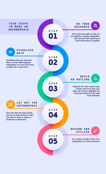
Creating an infographic template in AI

How to create a Vector Infographic, by Andrei Marius (tutsplus.com)

As a graphic and web designer there are a lot of different requests I get from clients. One that I haven’t needed to do in some time is to create an infographic. That being said, I think it’s at least a good tool to have in your “tool box” if the need ever arises. That, and considering that as part of my plan for this site I like the idea of adding a mix of different areas of art I think this is a great addition.

This post is about creating infographics in Adobe Illustrator by . The article appeared on tutsplus.com and if you’re interested it seems to be a comprehensive step-by-step guide to the process. I do have to acknowledge that I haven’t done the tutorial yet, but given time, I will attempt it. I typically don’t like templates, more for personal reasons than any other, but the result looks pretty good. Good enough for me to give it a shot.

As mentioned, the writer takes you through the process at a beginners steps, “1. How to Create a New Document and Set Up a Grid” to finish at what appears to be a generic, yet very professional infographic. Like I said, I’m going to give it a shot if only to have a ‘fall back’ if I have to create one in  rush.

Do the tutorial

Update: I sat down this morning to do the tutorial. I mean it looks pretty good and like I mentioned in the article, we should all know how to do an infographic. Let me just say that the tutorial was really bad. The author made simple things difficult and relied on this sense of,” let’s use the tools that are pretty much useless unless we have tutorials making us use them.” Serious, I couldn’t finish the tutorial and I’ve been using AI since about 1997, and I’ve been teaching it since about 2001, and let me repeat, I couldn’t finish it. I did however sit down and do the infographic in about an hour just copying  what the image looked like.

I guess if you’re new to AI then maybe you’ll get something from it, but I think a better way to do it is too sit down and play. You’ll probably be more creative and maybe even do something interesting.

Jennifer Townley

I recently came across an artist who does interesting mechanical sculptural works. The Dutch artist, according to her web site, ”

The works derive from her fascination with science, with an emphasis on physics, engineering and mathematics. Geometric patterns in Islamic art or mathematical drawings of Dutch artist M. C. Escher often serve as an inspiration. Images where lines and figures match each other so perfectly they could be repeated indefinitely. This infinity, regularity and obedience is what Townley also finds fascinating about mechanical machines; they are robust, strenuous and seemingly immortal. She is captivated by how a machine can convert a simple circular motion (rotary engine) into a very complicated nonlinear or chaotic movement pattern.    jenniferTownley.com

When it comes to the ‘cool factor’ Jenifer’s work is definitely in the area of cool. That being said, maybe it’s that I’m seeing her work transition and move based on the videos that I’ve seen, and I can’t help but feel that I’ve seeing the work through someone else’s perspective. In many pieces, especially those that are static, sometimes all you need is a photo of the work. Imagine though if the photographer took the photo of the Mona Lisa at a strange angle, or maybe too far away, or possibly even too close to the piece. You wouldn’t get to look at the things or areas that interest you. It could, in extreme cases change your perception of the work. This is what I think is happening to me with Jennifer’s sculptures. I know that they are cool, and that I would most likely stand mesmerized in front the pieces, but the video doesn’t do it justice… That is of course my opinion.

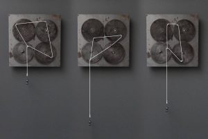
161 Days,   2012,   30 x 30 x 10 cm
Unique piece Metal, wood, electric motor, mechanical parts, white cord, lead.

So knowing that I have to kind of adjust my perception of her work into a more, “Wow, I bet that would be cool to see.” frame of mind, I want to give Jennifer the highest praise. The pieces that I’ve seen were effective as combining and contrasting both perception and shape. I was drawn to her piece, 161 Days. It is a combination of moving gears along with white string connected at various points around the gears. (The color of the string is important because it creates contrast.) It is an interesting joining of the shapes and perception, as Jennifer has stated she tries to accomplish. As the gears turn, the string will take on new shape as they are pulled in different angles. The eye focuses on the shapes and it can actually draw you in, and I guess maybe mesmerize the viewer.

There are several different paths that an artist can take when creating. I tend to view the quality of the piece on the end result. Kind of like the old saying, “How does it make you feel?” concept to art. There are others who will look at the technical aspect of the work, maybe the intricacies of the drawing, or the one observation that I personally don’t like to hear, “It looks so real.” If it looks so real, I mean, why not take a photograph? [small rant–sorry] You get the idea though, there are different aspects, or paths that an artist can take, and Jennifer has done an excellent job working with the perception  of the viewer, and less with the technical side of it. Her work can feel soothing and yet, makes me a little uncomfortable. If I’m correct on the simplified aspects to art, then my guess is that Jennifer is definitely in the, “How does it make you feel?.” camp.

If you’ve got the time and want to get mesmerized by her work there are videos on her site. I’ve included the video link here to one of her pieces, “Asinas”

Recent add-ons, including a new redesigned RSS feed.

I think I’ll make this update to KC’s art & technology short and sweet this morning. Not much has changed since the last update, mainly because I really haven’t found too much to add to the site. But, having said that, I’m working on a mobile app that will give readers a rss feed of this site. Hopefully there will be more, but for right now I’m starting small.

I haven’t ever made an app before, yeah, I’ve started probably about 10 or 12 in the past. For some reason I never seem to finish them. I’m not sure why, but it could be that I don’t use my phone for really anything. I’ve got a few games that I play from time to time, and there are at least a few occasions that I’ve needed it for navigation while I traveled, but I’m really not a phone person. I think that it’s been hard for me to understand why people use their phone like they do and why an app is warranted. I do understand, I just can’t identify with them. Nevertheless, I think it’s time that I at least try to get into the ‘app game’ so to speak.

The app is going to be focused on the blog posts and to do this I needed to call the site to get the updated entries. The only way I could figure out how to do this was to use an RSS feed. I’m not sure how well this will work in the long run, but I think it gives me at least a starting point.

In the meantime, if you’d like to take the new and improved RSS feed out for a test run, you’ll need some way to parse the code. Most people will use an extension on their browser (at least until the app is finished).

The link to the RSS feed (add to your rss reader)

Am I misguided, I like the rough, dilapidated look

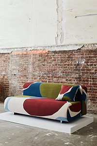
Credit: Photos by Pippa Drummond.

I was on a site called Design Milk this morning reading about the Visa Project, which according to Design Milk “is a lifestyle collective started by David Vivirido and Francesco Sourigues in 2018, will present their second pop-up exhibition in New York during NYCxDESIGN and ICFF.”

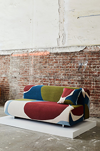
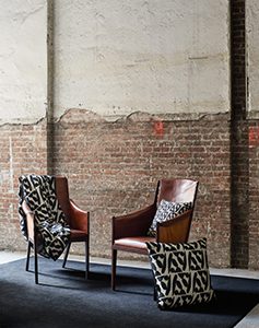
Their article is about furniture designs with a large collection of photos showcasing the work. I am the first to say that I am a complete beginner when it comes to discussing furniture designs. I do know what I like, and my tastes tend to be more minimalist or maybe even industrial. This furniture falls into that area, but the article I’m writing today isn’t about furniture, it’s about the space the work is in more than anything.

So as I mentioned I was scanning the page admiring the work when I realized that it wasn’t really the furniture that I was admiring, but it was the space the pieces were displayed in. Don’t get me wrong, the furniture is outstanding, but what really caught my eye was that nearly all the photos looked as if they were taken in an abandoned building. The building, possibly and old warehouse, was complete with exposed cement floors and bare electrical boxes. All the peeling paint and exposed bricks seemed to enhance the pieces exponentially. I think it’s the juxtaposition of refined with rough that makes it seem so cool to me. I’ve never understood why I am drawn more to locations like this than I am to modern, sophisticated locations, but I am. A rough, rock wall will draw me in faster than a modern glass wall, and I could say the same for architecture. Take the Guggenheim Museum in Bilbao for instance. I respect and in some ways admire the design of the building, but when pressed I don’t actually think I ‘like’ it. It doesn’t ‘call to me’ like other buildings.

Maybe it’s the idea that I had starting out that I wanted to be that “hipster artist” in NYC creating great artistic works. You may know the stereotype, they have one section of their loft as a workspace and the remaining is living area. I guess it was just a dream I had, though until I wrote the word “dream” I don’t think I ever considered that it was in fact a dream. Nevertheless, I love the images in the article mainly because of the location.

Credit: Photos by Pippa Drummond.

I’m going to post some of the images from the article here to give you an idea of what I’m writing about, but in all honesty I don’t know if I’m infringing on copyrights.

Let me know how you feel about it. Are you the same as me, doesn’t the ‘rough’ nature of the space draw you in? Maybe I’m crazy or possibly just confused.