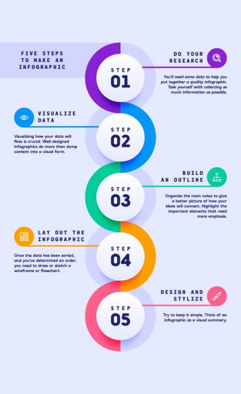
As a graphic and web designer there are a lot of different requests I get from clients. One that I haven’t needed to do in some time is to create an infographic. That being said, I think it’s at least a good tool to have in your “tool box” if the need ever arises. That, and considering that as part of my plan for this site I like the idea of adding a mix of different areas of art I think this is a great addition.
This post is about creating infographics in Adobe Illustrator by . The article appeared on tutsplus.com and if you’re interested it seems to be a comprehensive step-by-step guide to the process. I do have to acknowledge that I haven’t done the tutorial yet, but given time, I will attempt it. I typically don’t like templates, more for personal reasons than any other, but the result looks pretty good. Good enough for me to give it a shot.
As mentioned, the writer takes you through the process at a beginners steps, “1. How to Create a New Document and Set Up a Grid” to finish at what appears to be a generic, yet very professional infographic. Like I said, I’m going to give it a shot if only to have a ‘fall back’ if I have to create one in rush.
Update: I sat down this morning to do the tutorial. I mean it looks pretty good and like I mentioned in the article, we should all know how to do an infographic. Let me just say that the tutorial was really bad. The author made simple things difficult and relied on this sense of,” let’s use the tools that are pretty much useless unless we have tutorials making us use them.” Serious, I couldn’t finish the tutorial and I’ve been using AI since about 1997, and I’ve been teaching it since about 2001, and let me repeat, I couldn’t finish it. I did however sit down and do the infographic in about an hour just copying what the image looked like.
I guess if you’re new to AI then maybe you’ll get something from it, but I think a better way to do it is too sit down and play. You’ll probably be more creative and maybe even do something interesting.

